Some names in finance are built on noise. Others are built on time. ISP Group belongs to the second kind: an investment house headquartered in Switzerland, with offices in several of the world’s financial centers, that has spent more than three decades putting capital to work for a client base that stays. By 2025 the house had the standing.
The brand had not kept pace with it. The mark looked dated, the communication was scattered, and little of it carried the quiet authority the firm had earned. Our work was to bring the legacy forward: to refine the identity, build a full visual and verbal language around it, and give the house a website with the same composure as the business behind it.
- Sector
- Finance & Investment
- Service
- Website
- Branding
- Year
- 2025
- Location
- Switzerland

A mark worth keeping.
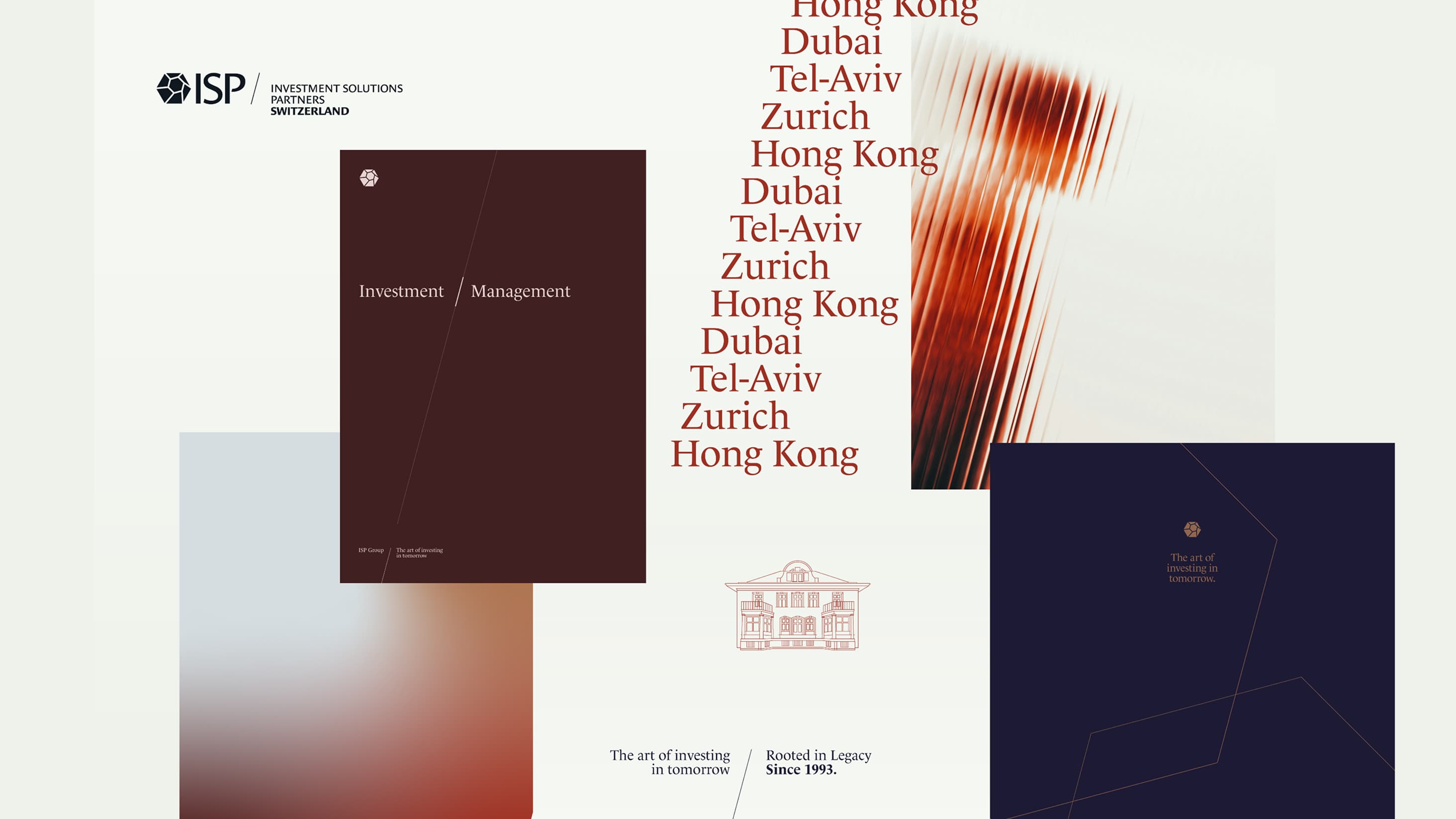
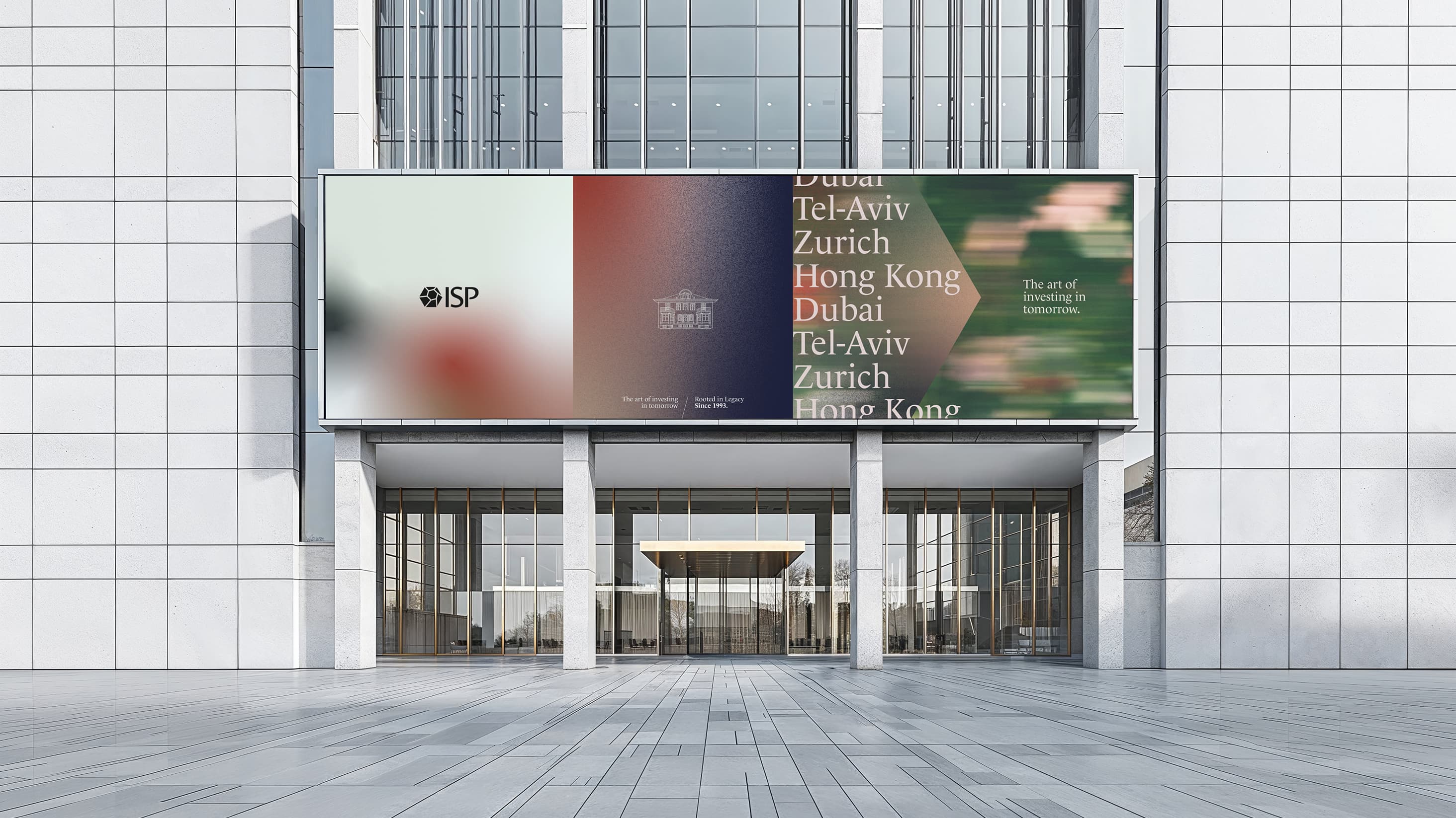
The logo was an asset to respect. We refined it instead of replacing it: sharper legibility, cleaner alignments, and a form that holds at any size, in print and on screen alike. At its center sits the villa, the symbol clients already associate with the house.
We kept it and gave it room, so that recognition built over thirty-two years carries straight into the next thirty.
A language of restraint.
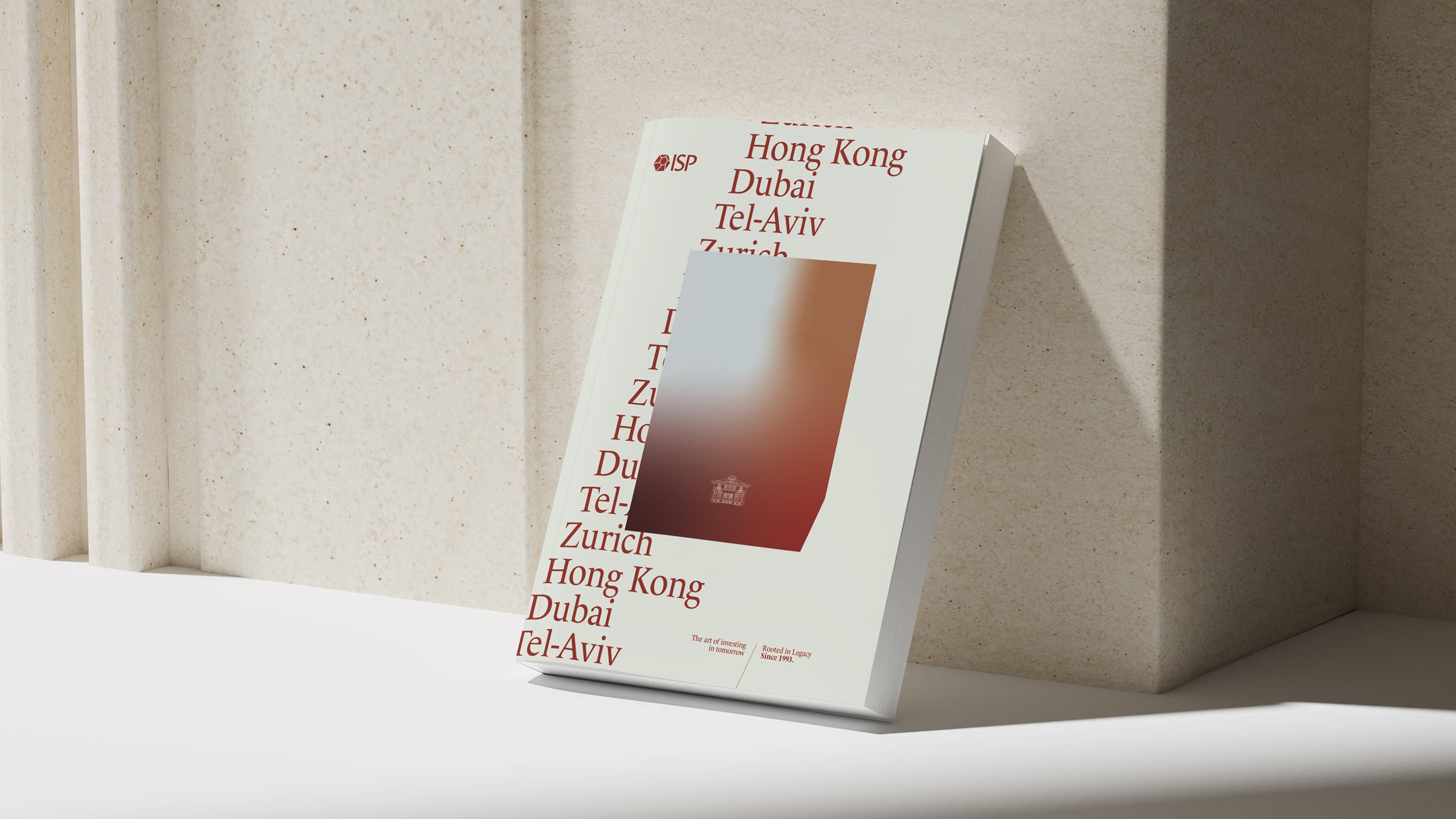
Around the mark we built a complete identity: color, type, imagery, and a verbal line the whole house could speak in. The direction was deliberately spare. Soft gradients and a considered image library give the brand its signature, and generous space lets each piece settle.
In a sector that tends to crowd every surface with charts and claims, that restraint reads as a breath of fresh air.
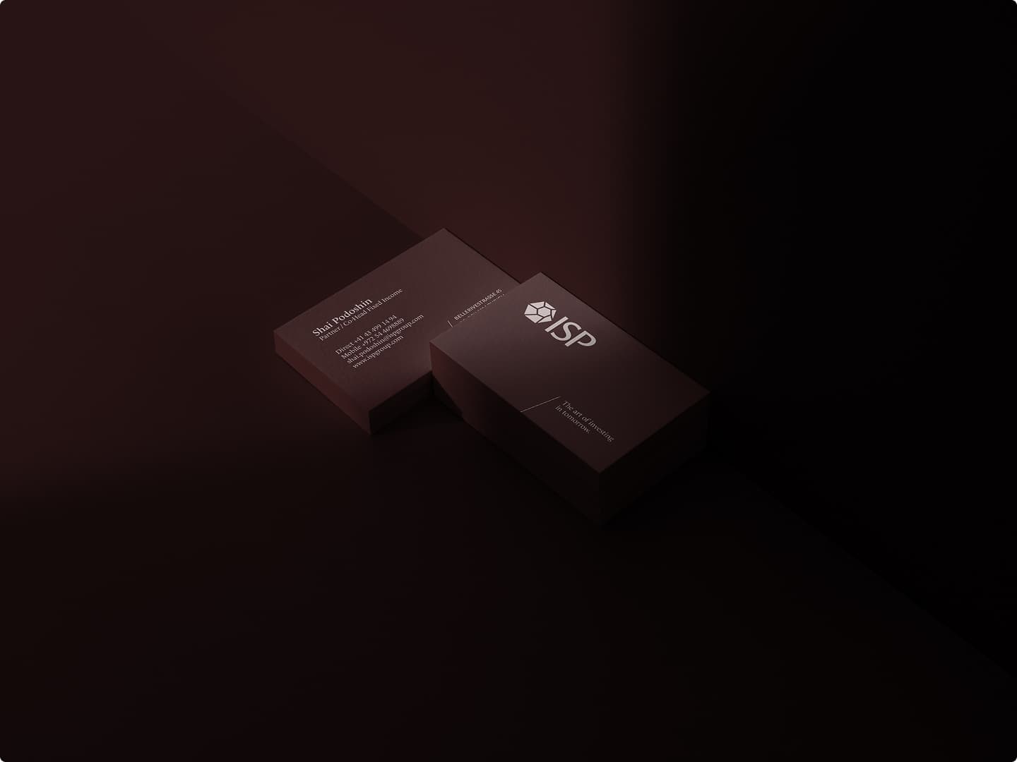
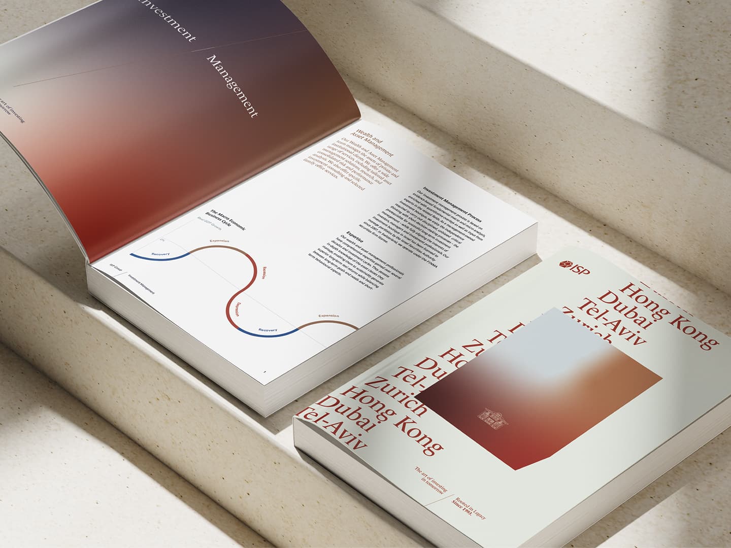
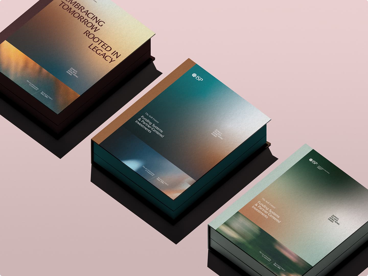
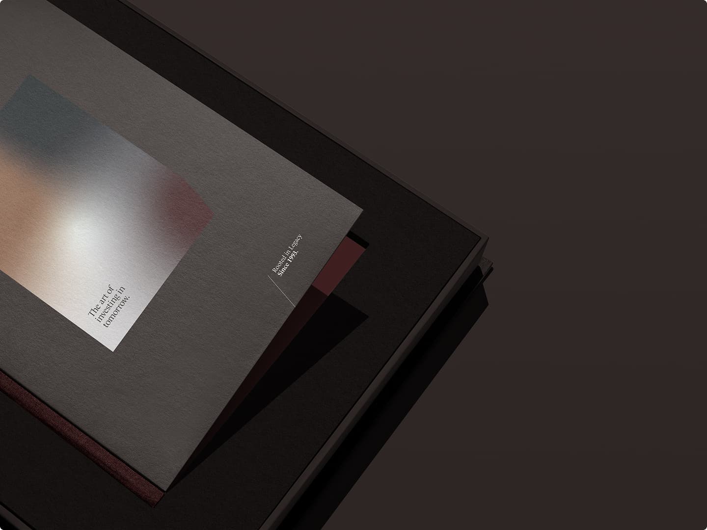
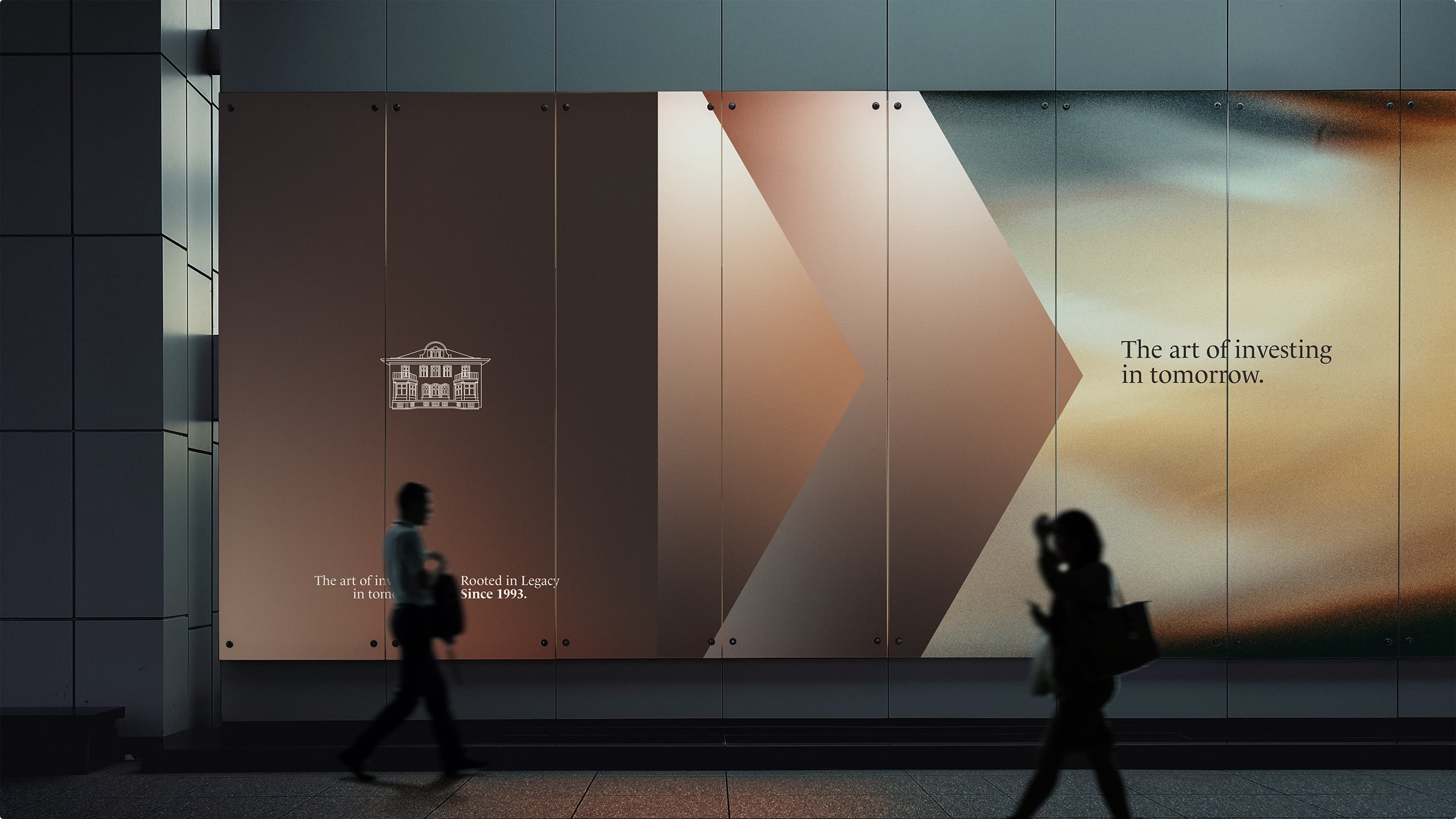
The art of investing in tomorrow.
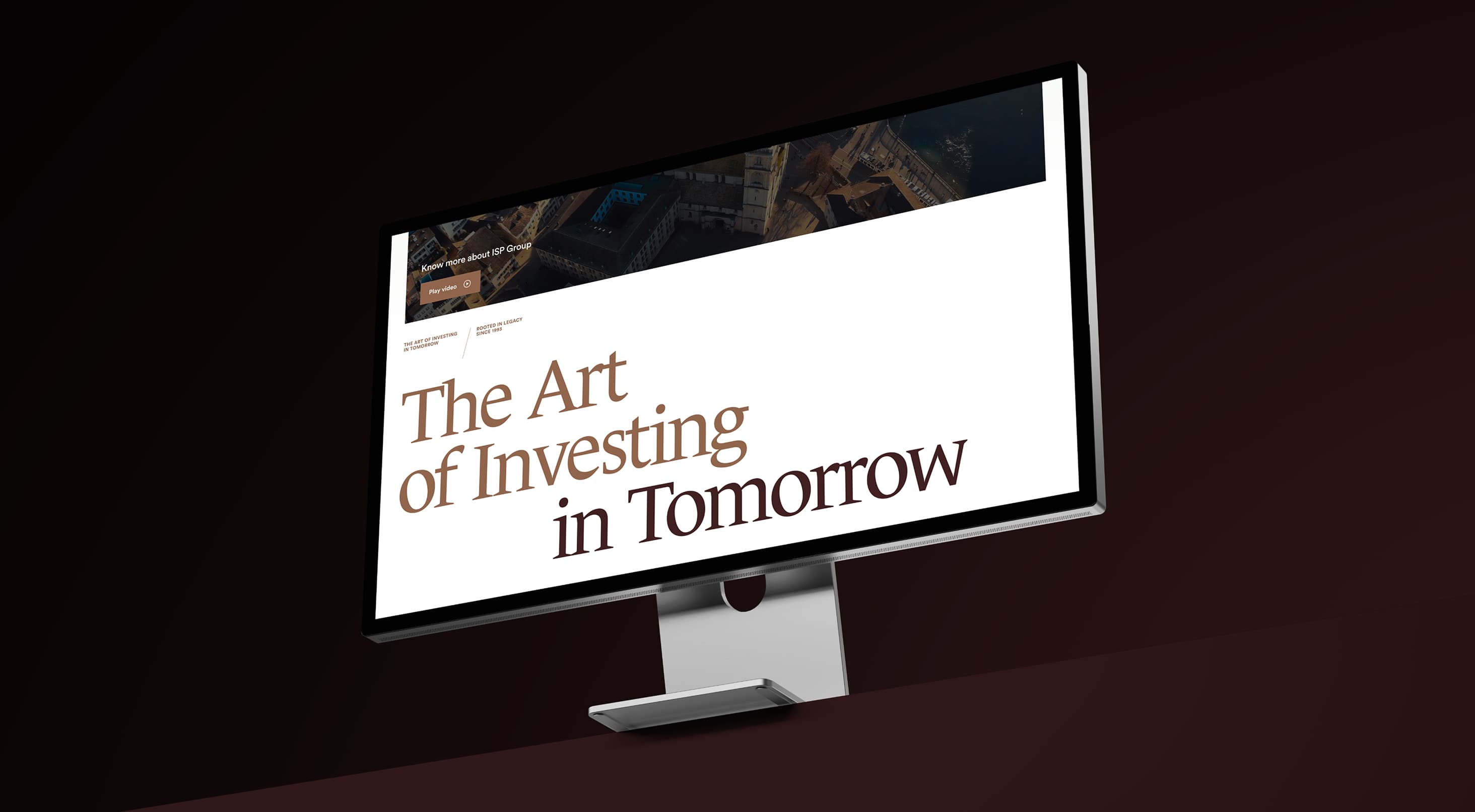
Every house needs a line that says what it believes. We wrote “The art of investing in tomorrow,” paired with “Rooted in legacy since 1993.” Together they hold the two halves of ISP in a single breath: a firm with a long memory and a longer view, carrying three decades of conviction into whatever comes next.


A website with composure.
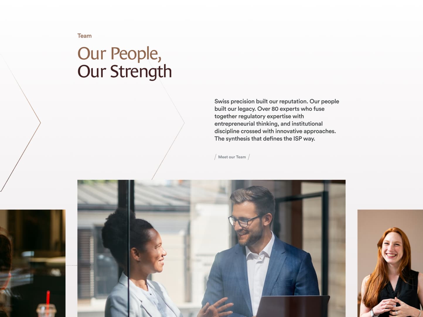
The new website, built in 2025 on Svalla CMS, carries the identity from end to end. It moves calmly, lets the imagery and gradients do the work, and gives each strategy, office, and point of contact a clear place to land. Because the team can keep it current themselves, the brand stays as considered in its second year as on the day it went live.
Other projects
More worth seeing
A few other brands we have shaped, and the experiences we built around them.